
Generating eye catching visualizations and charts is becoming easier by the day. With the data deluge, and the pervasion of data science, machine learning and artificial intelligence without an understanding of where the data is coming from or existence of bias in the way the data has been collected is leading most (if not all) of us being a victim of unconscious propaganda and digital activism. Add the need to grab attention in the content based marketing world – driven by obsession with search engine rankings and grabbing most views, likes and shares on professional networking platforms – we have the perfect recipe for disaster.
Having more data doesn’t make it easier to communicate. It makes it harder!
The root of all evil
In schools, we have language subjects and then we have math subjects. It is rare that anyone of us were taught how to combine these two. And that leaves us undercooked for one of the most important tasks for the digital world we live in today – making sense of all the data. Being able to process these data, visualize it and developing a compelling story on it will enable us to fulfill our desire of evidence based decision making. Being adept in Tableau, Power BI or R Shiny is not a differentiation – being a storyteller is.
Key considerations for compelling data storytelling
a. Setting the context: The first item on this list has nothing to do with visualizations. To communicate well, we should know who we are talking to. And why. If you were talking to a brother versus the dad – about a school game you won, you would choose different words, tone and details in the conversation, wouldn’t you? Same goes for a dashboard or a report. Is the dashboard for use by the sales team or for the Chief of Sales? And then, we should consider how is it being done – whether it’s a conference room presentation, just and email or a monthly report
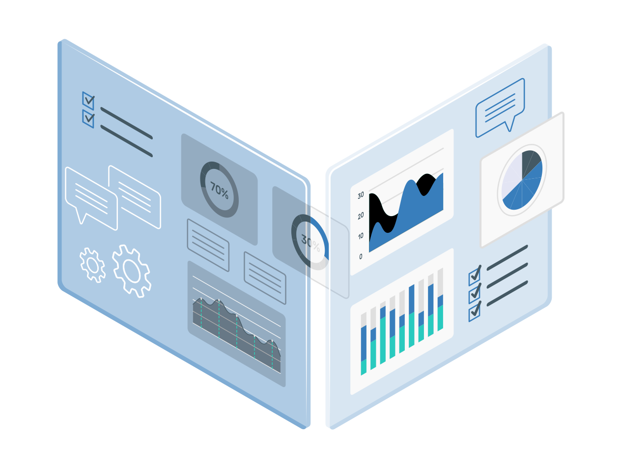
b. Knowing how to show results: I have personally used more than 100 different visualizations in my 10+ years of professional work. If I were to analyze all the work I have produced, the results might follow the Pareto principle i.e. 80% of my work would be based on only 20% different visuals. Broadly speaking, we should know when to use tables, pie-chart family of visuals, bar-graph family of visuals, line graphs. It would also be valuable to know the purpose of showing a visual – is it a comparison across years or growth over the years that you want to highlight? What visuals to choose if the growth numbers are low in absolute terms (but might not be a poor achievement) vs. if the scale of growth is, say 20-40%? And then, you need to decide what details are you going to show?
It is obviously not possible to go through each type of visualization here, and that is not the intended purpose even. In most cases, you would have to choose between multiple suitable options. The general principle is – the simplest visual that captures all that you want to convey is your best choice
c. Design Thinking: The visualizations should be intuitive and simple to interpret and understand. Always remember, the purpose of the visualization is to communicate – and not showing off your ability to be able to create awesome looking graphs that divert attention, and lead the audience away. You should try to highlight the important stuff and eliminate distractions. The designs should be accessible, and not overcomplicated. And lastly, make your visuals aesthetically pleasing
d. Weaving the Story: Why do we love reading books? Because, it grabs our attention and creates an emotional connect. And after finishing it, you might also discuss about the book with your friends. And since we have been communicating with stories, in infancy and beyond, it is easy to leverage storytelling to communicate with your audience and create an emotional connect. One of the approaches could start with a plot for your data story, filling in the details in the middle part and call to action at the end. And in case you are wondering, who is the subject of the story – it has to be your audience
e. Putting it all together: Every data story should begin with the audience, and end with a story. And as we discussed above, the story should have key takeaways. It helps if you understand the purpose of your work i.e. why are you working on creating a dashboard or a report. And the intended use of the dashboard.
At Xtage Labs, we try to blur the line between numbers and insights. We see visualizations more as an art than science. And since dashboards, reports or just a power point presentations are the primary ways in which we deliver our final results, we understand the need for compelling visuals and communicating effectively.
Xtage Labs is an advanced analytics and machine learning based decision insights company. We work with businesses to derive insights from data, and improve the decision making processes.
Get in touch with us to find out what we can do for you.
Credits: I would like to acknowledge that the post is broadly a summarization of Cole Nussbaumer Knaflic’s work – Storytelling with Data


